Sep
2017
September stockmarket: seasonality effects and anomalies
DIY Investor
6 September 2017
 The latest edition of Stephen Eckett’s fascinating reference book may have you scratching your head in search of a rational explanation for what is presented, but one thing is for sure, you’ll return to it again and again as 2017 unfolds.
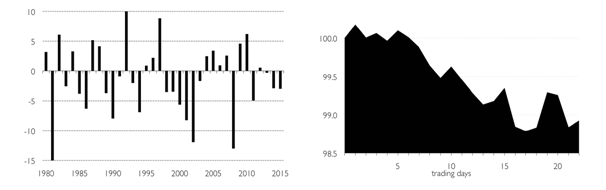
The UK Stockmarket Almanac: Market performance this month
After summer the stockmarket tends to burst back into life in September. Unfortunately, the renewed activity in shares tends to be on the downside. Since 1984, the FTSE 100 has an average return of -1.1% in this month, which gives September the worst record for shares of any month in the year. And things haven’t improved recently – since year 2000 the average return in September has been -1.9%.
However, although the average return is bad for the month, about half of all Septembers actually have positive returns. The problem is that when the market does fall in this month, the falls can be very large. For example, as can be seen in the accompanying chart, the market has fallen over 8% in three years since 2000.
In an average month for September, the market tends to gently drift lower for the first three weeks before rebounding slightly in the final week – although the final trading day (FTD) of the month has historically been one of the weakest FTDs of all months in the year.
The Psychology of Drawdowns
September has a reputation for market volatility, so let’s look at losses.
How do investors measure unrealised losses? One way, of course, is to compare the current price with the price paid for an investment. So, for example, if you pay 100 for an investment and its current market price is 90, then you are sitting on a (unrealised) loss of 10%. But if, after buying the investment at 100, the price had risen to 120 before then falling back to 90, then there is the temptation to anchor the price at 120 and regard the current price of 90 as a 25% loss.
This 25% loss is referred to as the drawdown, which is defined as the percentage loss from a previous peak. The concept is common in trading but can also be useful for investors.
The following chart shows the drawdowns for the FTSE All-Share for the period 1969-2016.
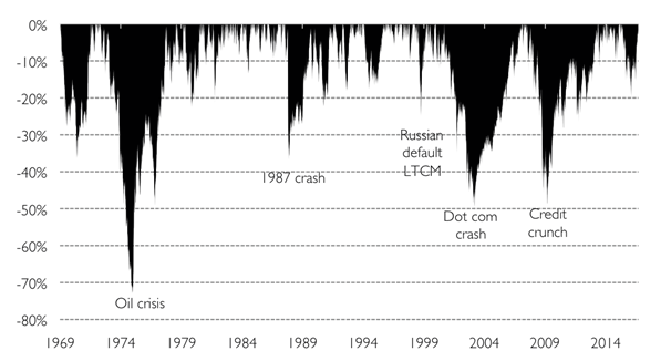
The first thing to notice about the chart is that there are an awful lot of drawdowns! In fact, because the market doesn’t make new highs every day, it is usually in a drawdown state. And this can have a psychological effect on investors.
If you look at a typical long-term chart of the stock market, and many individual shares, you will usually see a line that starts at the bottom left and increases (moderately steadily) to the top right. This is a good thing – stocks go up in the long term! However, this chart does not necessarily reflect the actual experience of being invested in the market over this period. For this, the drawdown chart above may more accurately represent the feelings of investors. This is because investors’ portfolios are underwater for most of the time, i.e. the portfolio value is below its peak value (which will likely be a recent and strong memory for the investor).
The table below down how long the market spends at various drawdown levels. So, for 16% of the time from 1969, the market had a drawdown of 5%-10%, and it was in a drawdown state of over 20% for 27% of the time. And, while a drawdown of just up to 5% may not seem very much, in practice it is 31% of the time that investors are likely feeling slightly disgruntled, having “lost” money.
| Drawdown | Time spent |
| 0% to 5% | 31% |
| 5% to 10% | 16% |
| 10% to 20% | 21% |
| Greater than 20% | 27% |
So, while the data shows us that stock markets increase over the long term, the direct personal experience of investing may be for investors largely that of a prevailing sense of loss. This sense of loss is something that investors have to learn to live with.
To purchase this book for the special DIY Investor price of £18 + P&P (RRP £25) use the following promotional code when checking out at the Harriman House online bookshop: DiYEE15.
Leave a Reply
You must be logged in to post a comment.